design dump
# githubs tag color scheme
# whatwg
All the standards websites are gorg.
# design in 4 mins
https://jgthms.com/web-design-in-4-minutes/ (opens new window)
fab idea if i disagree with some points
saw it linked first from another post on https://www.swyx.io/ideas (opens new window) about most minimal css to make things 99% better:
html {
  max-width: 70ch;
  padding: 3em 1em;
  margin: auto;
  line-height: 1.75;
  font-size: 1.25em;
}
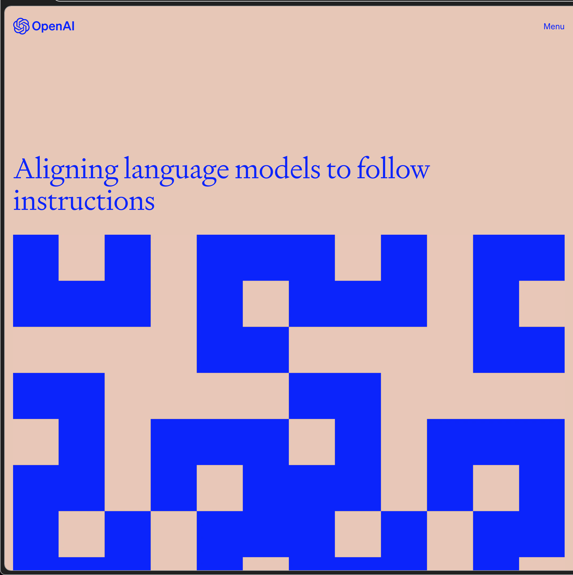
# openai color scheme:
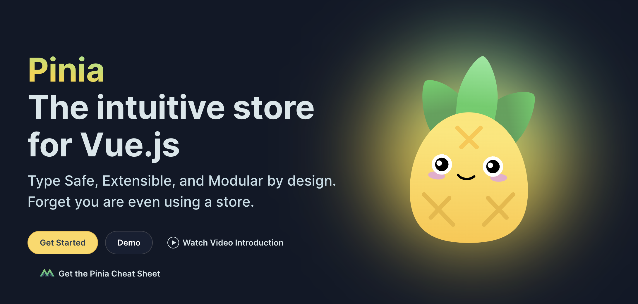
# glow steamy shower door
I wonder if this is a trend that in 10 years we'll look back on as something so dated. I can't imagine that currently, but alas, can we ever (80's big hair, or mullets, or The Rachel). That's to say that I love the glow / "steamy shower door" effect. Here's an example of from pinia's documentation:
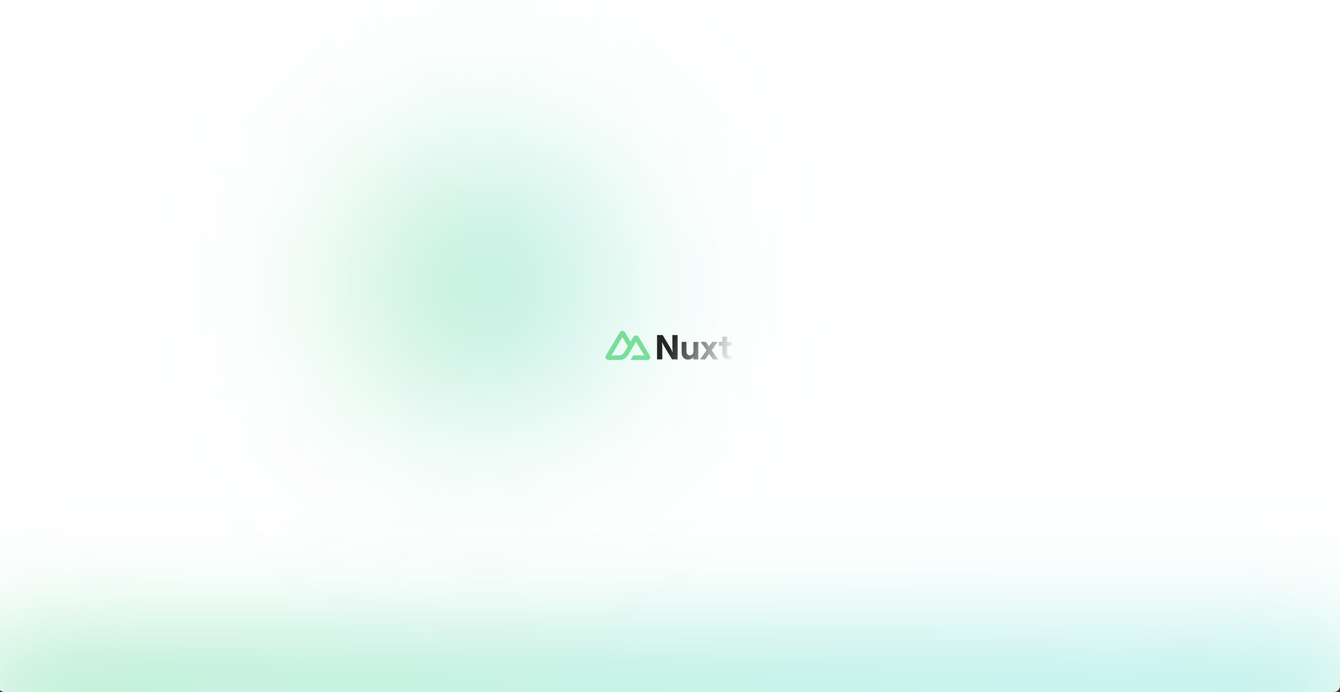
And here's another from a nuxt starter project when you have a TS error, much more friendly than the terminal-style:
# homebrew browsin
I'm making this thing breview, homebrew preview, and each formula has a homepage key. Most are as cool and classic as you would expect:
# eng-tips.com, the height of style:

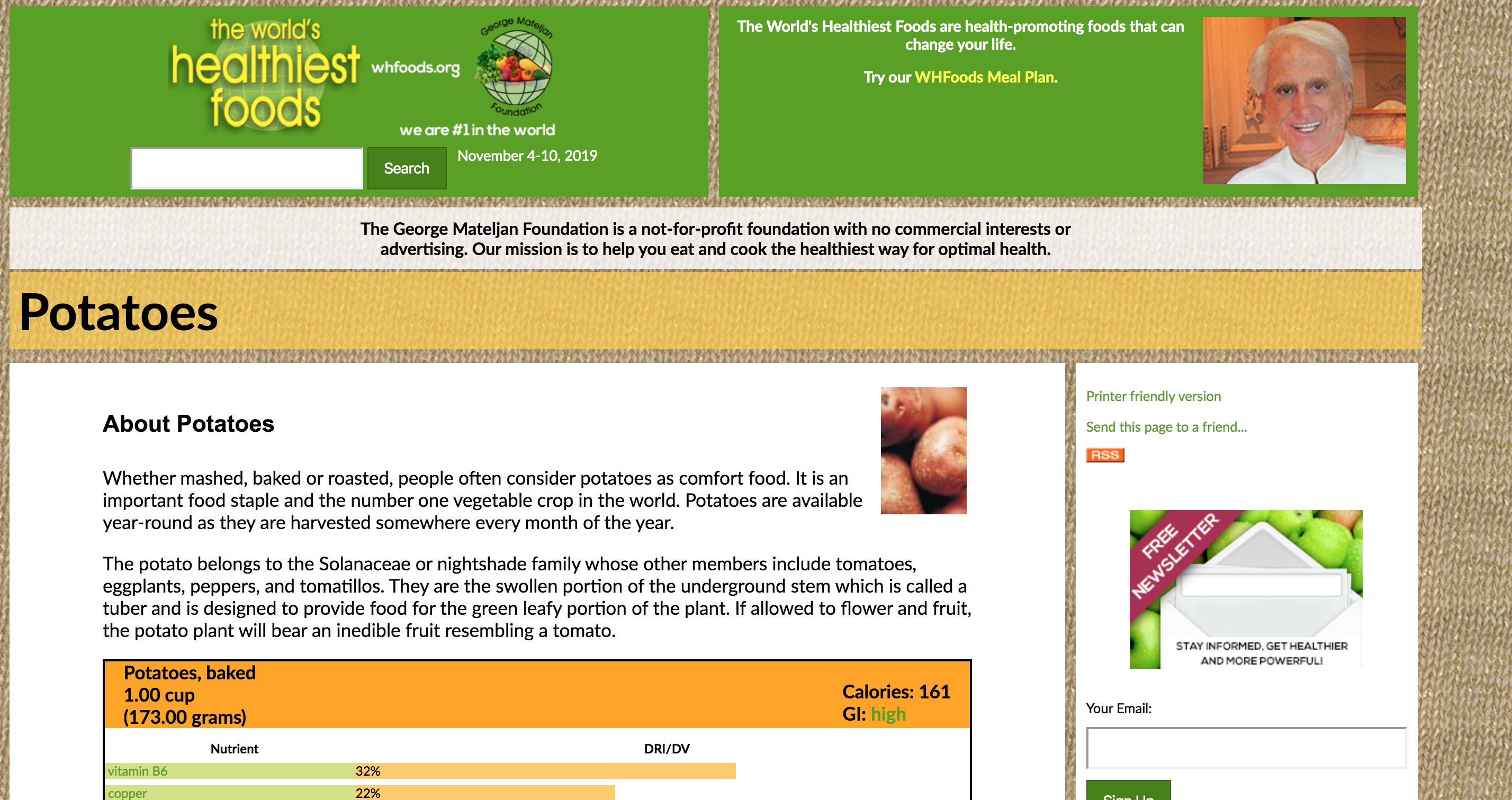
# whfoods
from this sick site (opens new window) that has a built in note taking widget, ratings, chat, and amaze design :~)
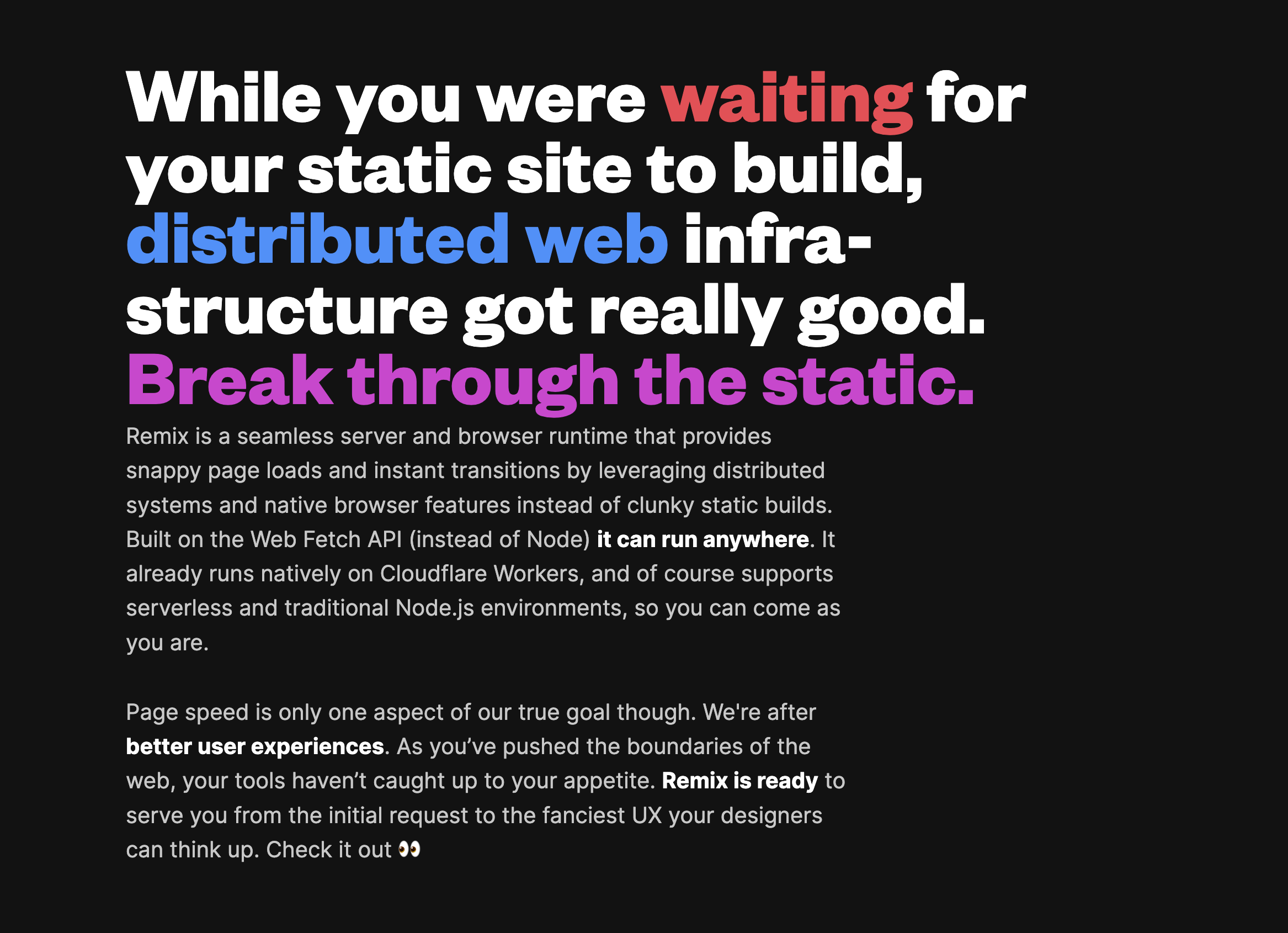
# remix framework
Not only is this framework cool (island progressive enhancement paradigm) but the design is fab:
# pretty browser engineering site
# verdana 4 fun, courier for speed
There is a rapid shifting of media: from printed paper to computer screens. This transition is modifying the process of how we read and understand text. The efficiency of reading is dependent on how ergonomically the visual information is presented. Font types and size characteristics have been shown to affect reading. A detailed investigation of the effect of the font type and size on reading on computer screens has been carried out by using subjective, objective and physiological evaluation methods on young adults. A group of young participants volunteered for this study. Two types of fonts were used: Serif fonts (Times New Roman, Georgia, Courier New) and Sans serif fonts (Verdana, Arial, Tahoma). All fonts were presented in 10, 12 and 14 point sizes. This study used a 6 X 3 (font type X size) design matrix. Participants read 18 passages of approximately the same length and reading level on a computer monitor. Reading time, ranking and overall mental workload were measured. Eye movements were recorded by a binocular eye movement recorder. Reading time was minimum for Courier New l4 point. The participants' ranking was highest and mental workload was least for Verdana 14 point. The pupil diameter, fixation duration and gaze duration were least for Courier New 14 point. The present study recommends using 14 point sized fonts for reading on computer screen. Courier New is recommended for fast reading while for on screen presentation Verdana is recommended. The outcome of this study will help as a guideline to all the PC users, software developers, web page designers and computer industry as a whole.
# itty
pretty cool tool (opens new window) and technically creative, you can make a little site where all data is then contained in the url generated. Here's the code (with some chars removed) for the following iframe:
<iframe
  width="500"
  height="500"
  style="-webkit-transform:scale(0.5);-moz-transform-scale(0.5);"
  src="https://itty.bitty.site/#Scripting/XQAAAAJXBwAAAAAAAAAeHMqHyTY4PyKmqfkwr6ooCXSIMxPQ7ojYR153HqZD3W+keVdvwyoyd+luwndzoLxdmwItTzdhlW/RlpwKcSTjgU0cmFK/XNlVfh/tSj+bkMJPSk6bm6A5pI4sBMlNECfMK6m9fdbElWXJDT/2lzPqQ=="
></iframe>
# markboulton.co.uk
this blog and link collector of a typographer]
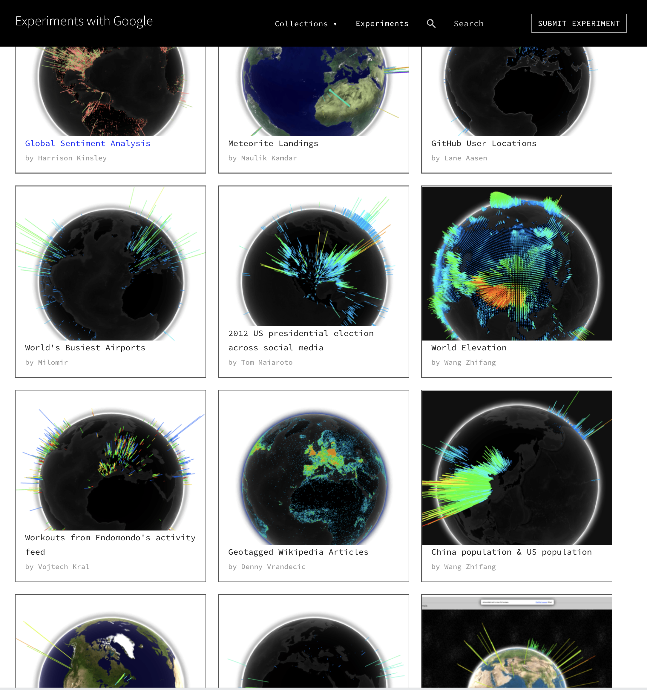
# all of experiments.google.com
OK maybe not every single one, but most of em (opens new window)... look at this WebGL globe collection:
# dotshare.it
amaze idea too (opens new window)
# this professor's physics site
the colors layout ux (opens new window)... thinking of copying
# imgs
# pretty if ubiquitous
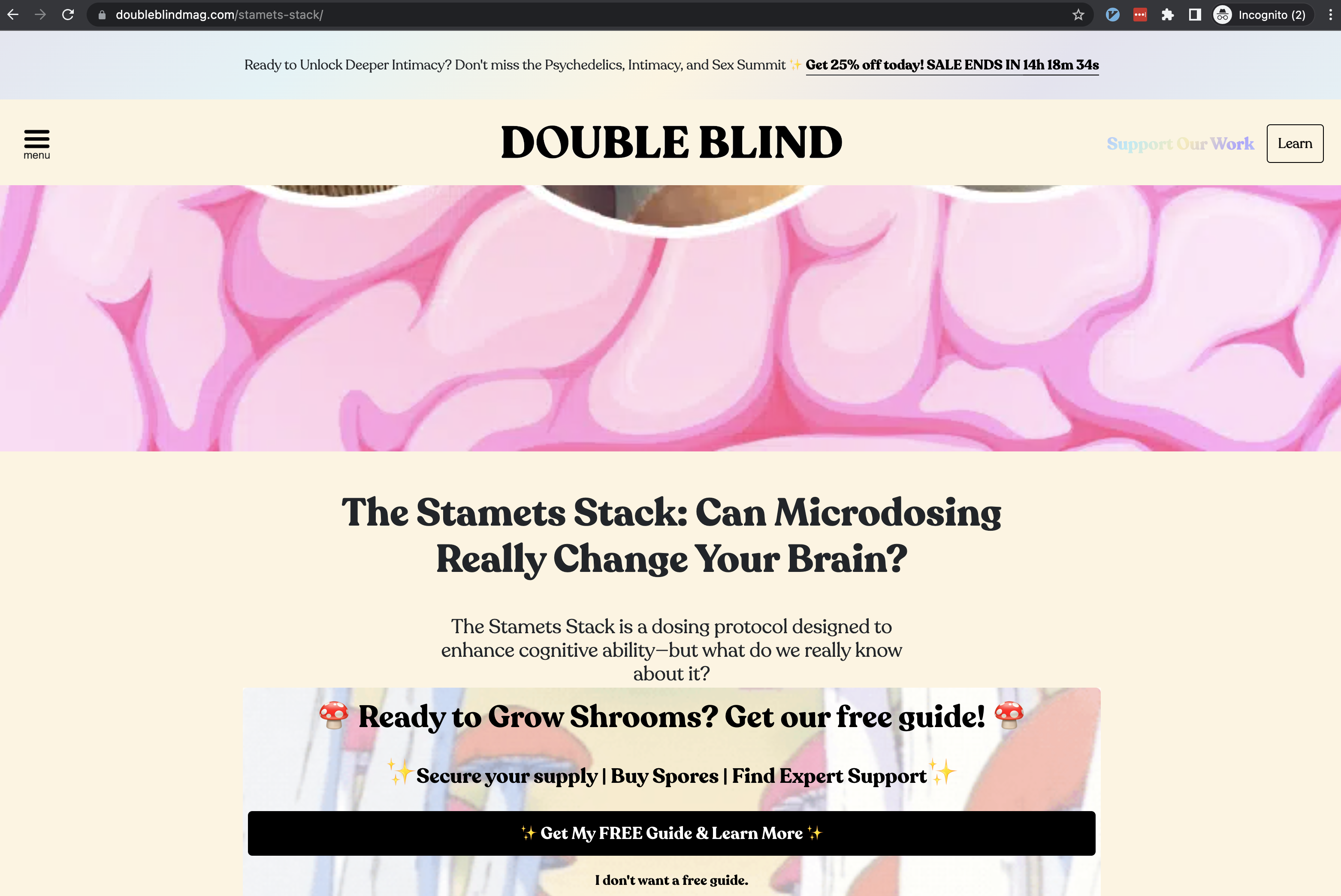
was watching Fantastic Fungi and came across this Paul Stamets character. Thought the design, font, colors, animations on double bling mag (opens new window) were pretty.
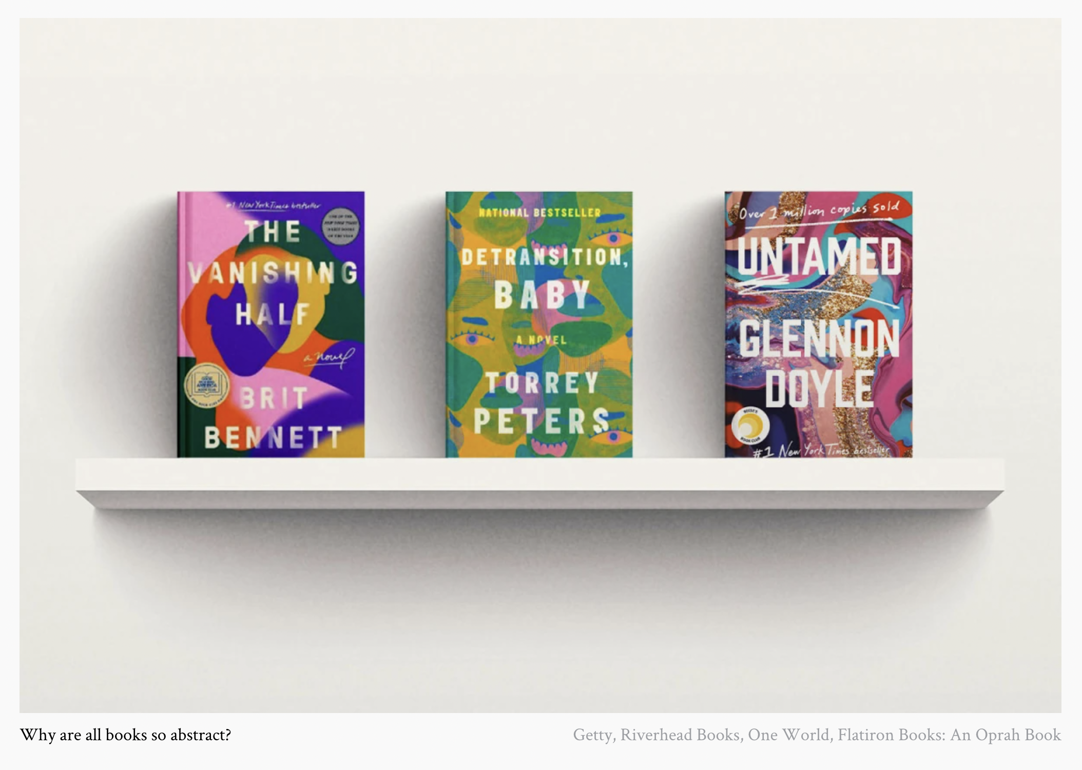
However pretty, this style seems to be metastasizing both online and off and reminds me of how every new book cover looks:
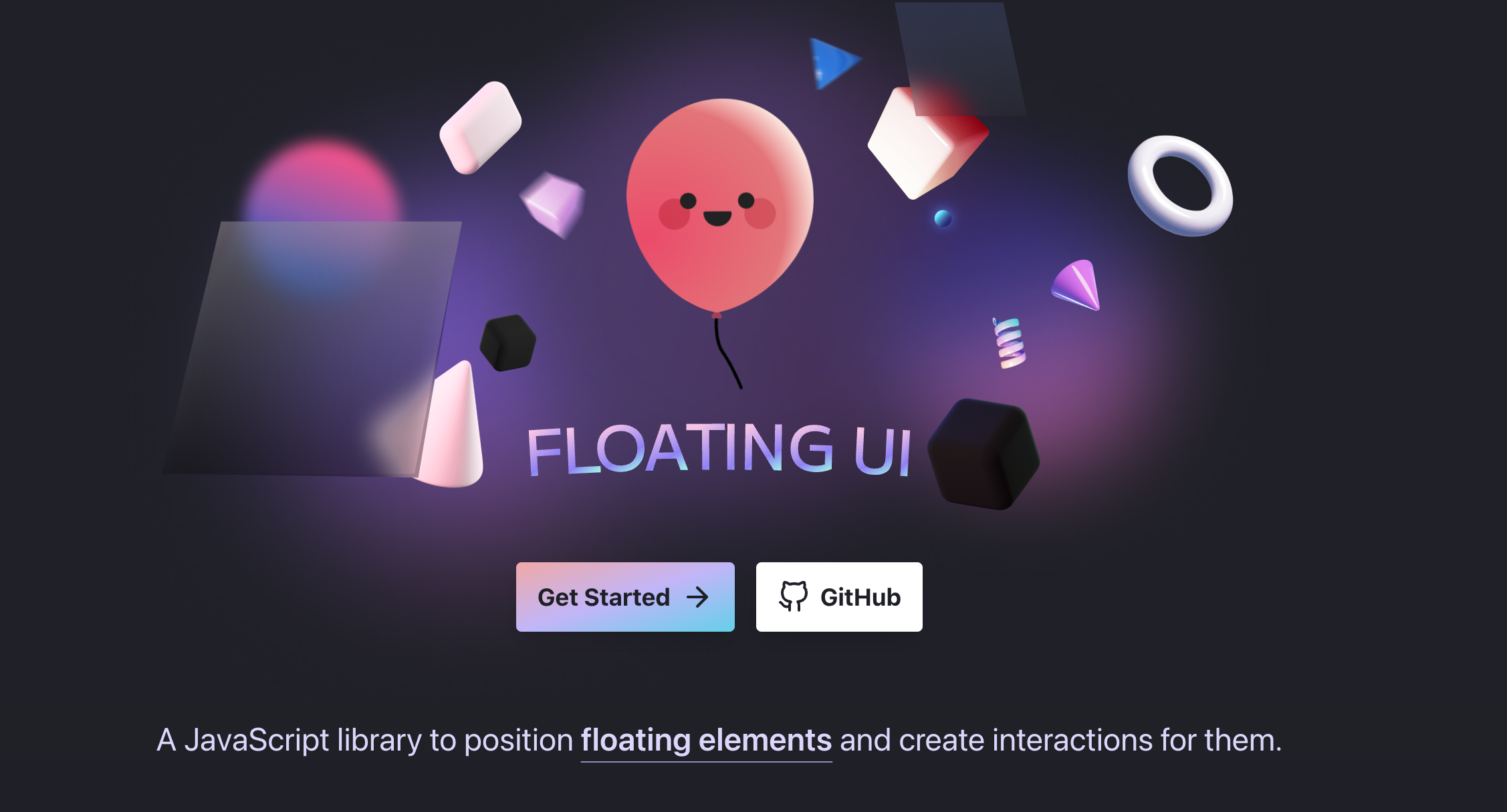
# floating-ui
Was browsing github came across this lib whose documentation website has gorg lil floating blurred squares [https://floating-ui.com] around in the nav links. I personally love the frosted glass / hot shower glass door look:
# literally design:
OS housing design w/ CNC wikihouse (opens new window).
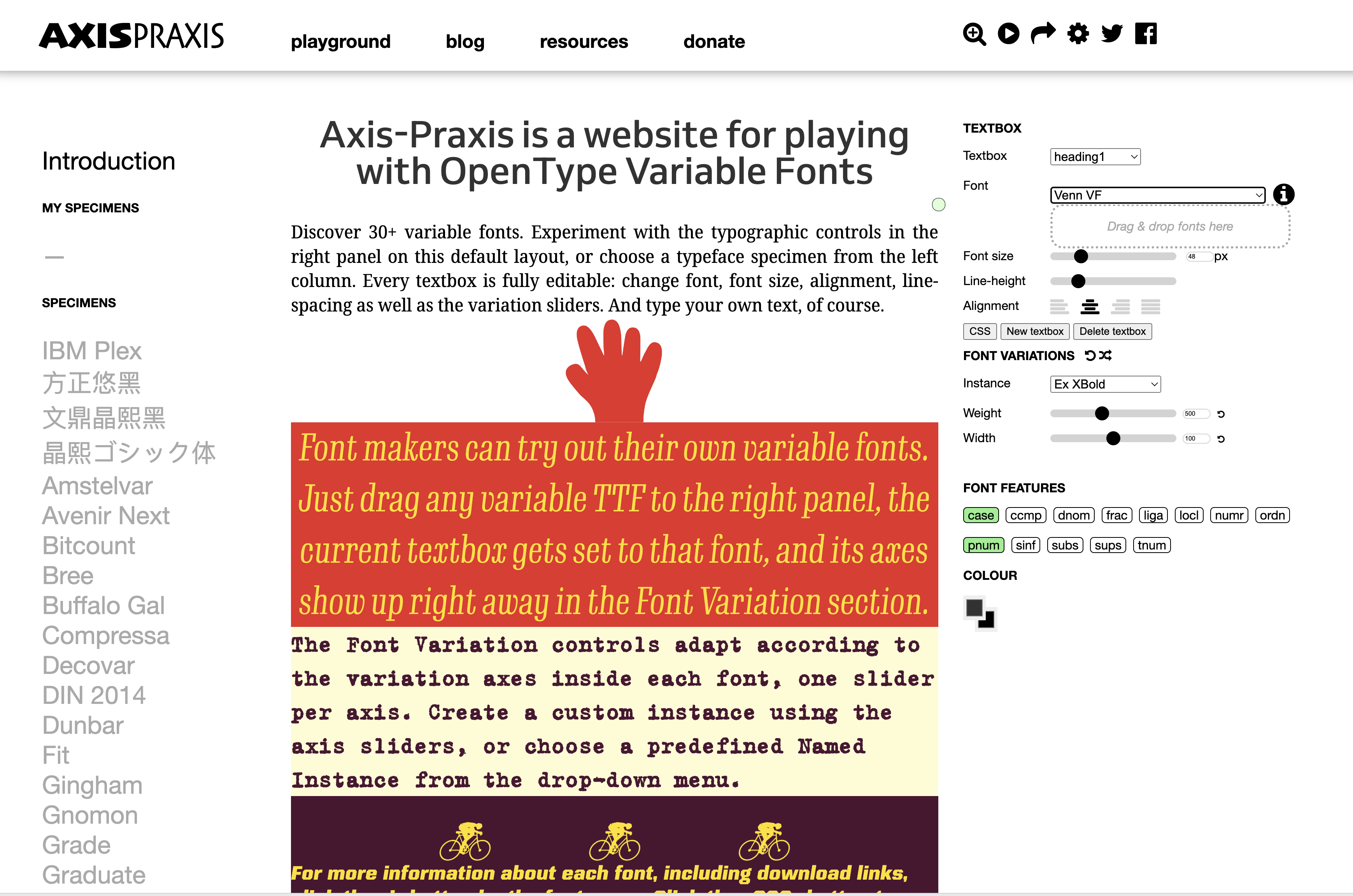
# variable font playground
https://www.axis-praxis.org/specimens/DEFAULT (opens new window)
# general reference, cross-computing tools and techniques, design
a big ole massive resource (opens new window)
# 1001freefonts
eggsactly what is sounds like: 1001 free fonts (opens new window)
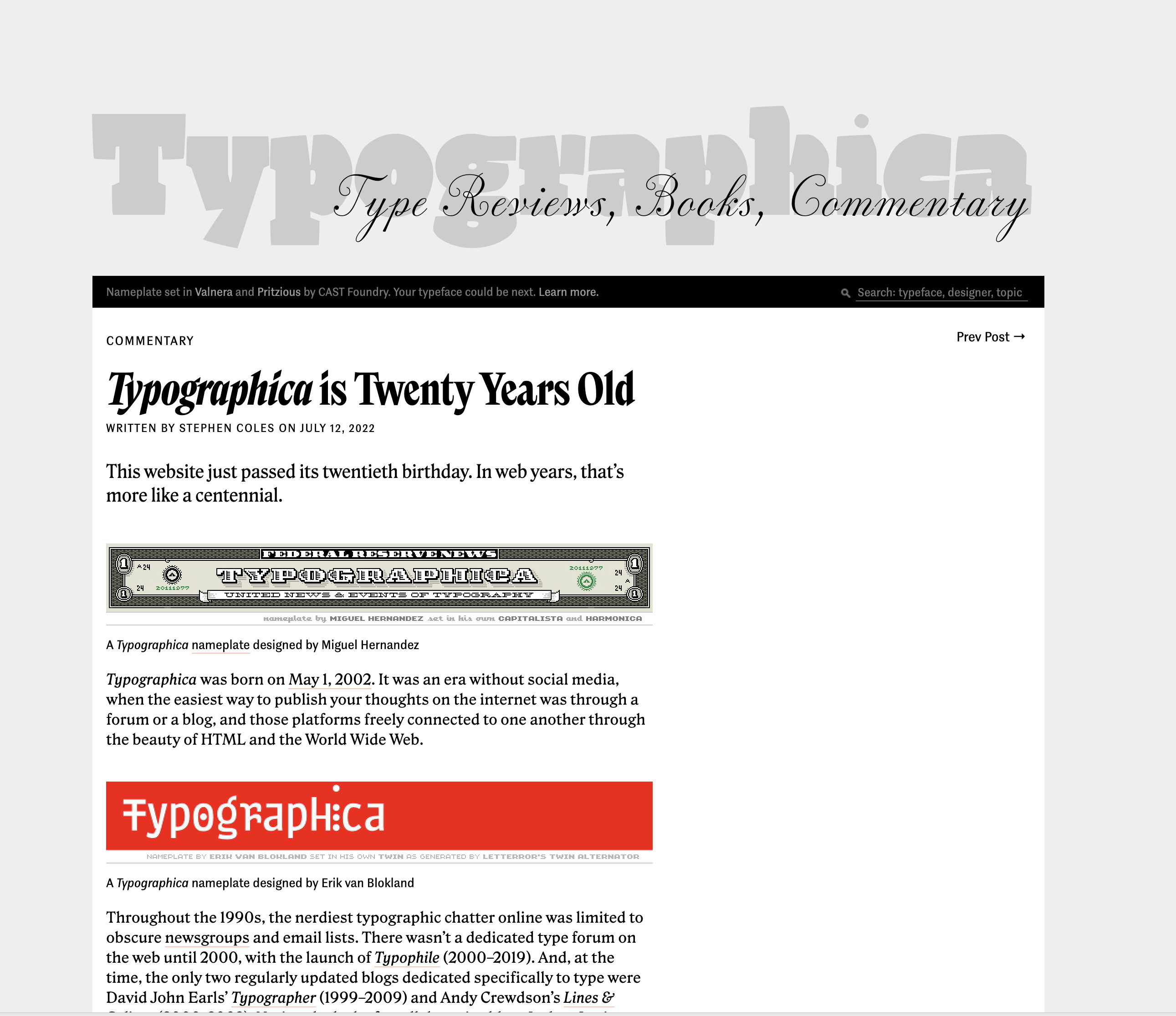
# site that's been publishing about typography for 20 years
typographica (opens new window)
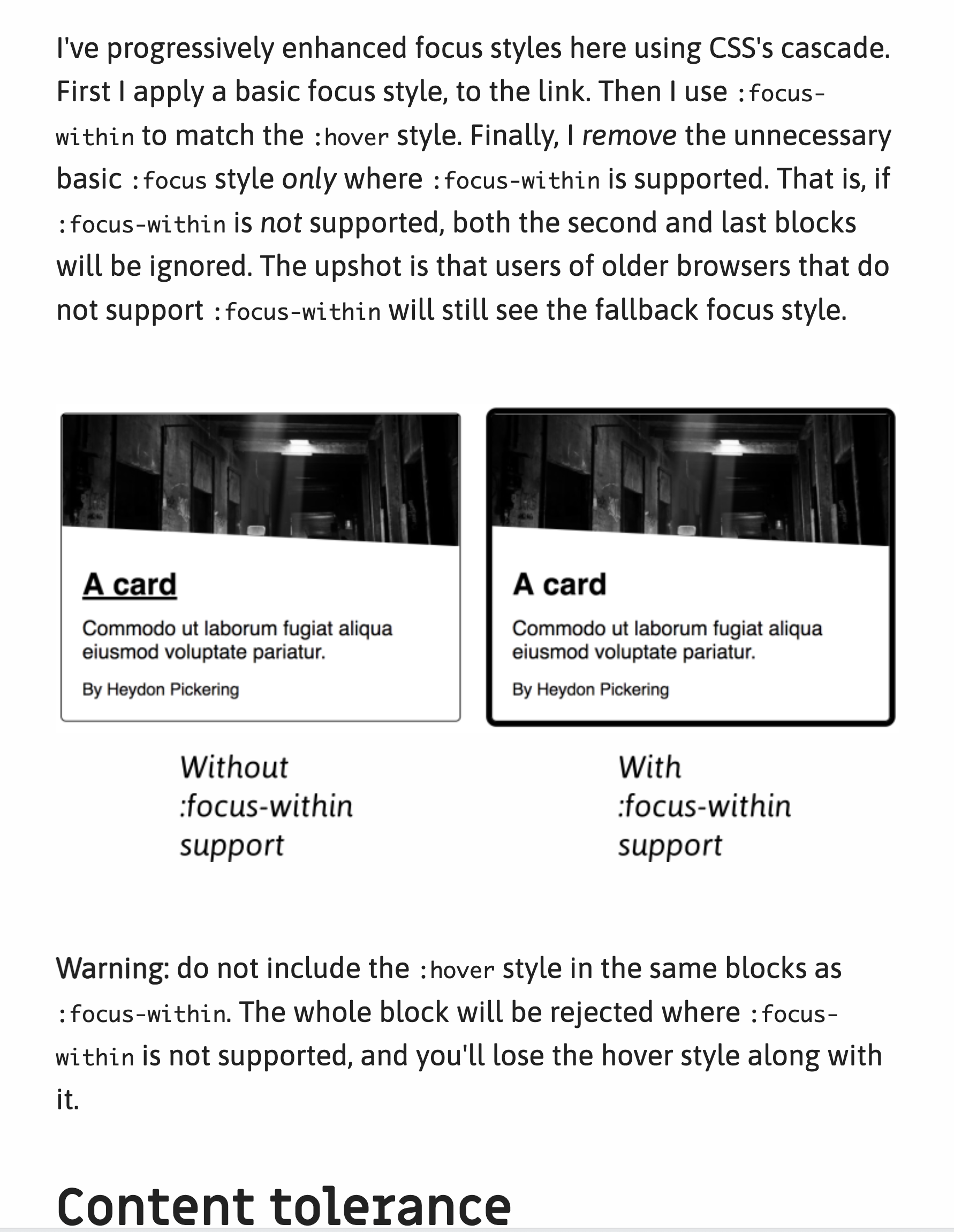
# design guidelines for most popular components
Check out this one (opens new window) about cards.
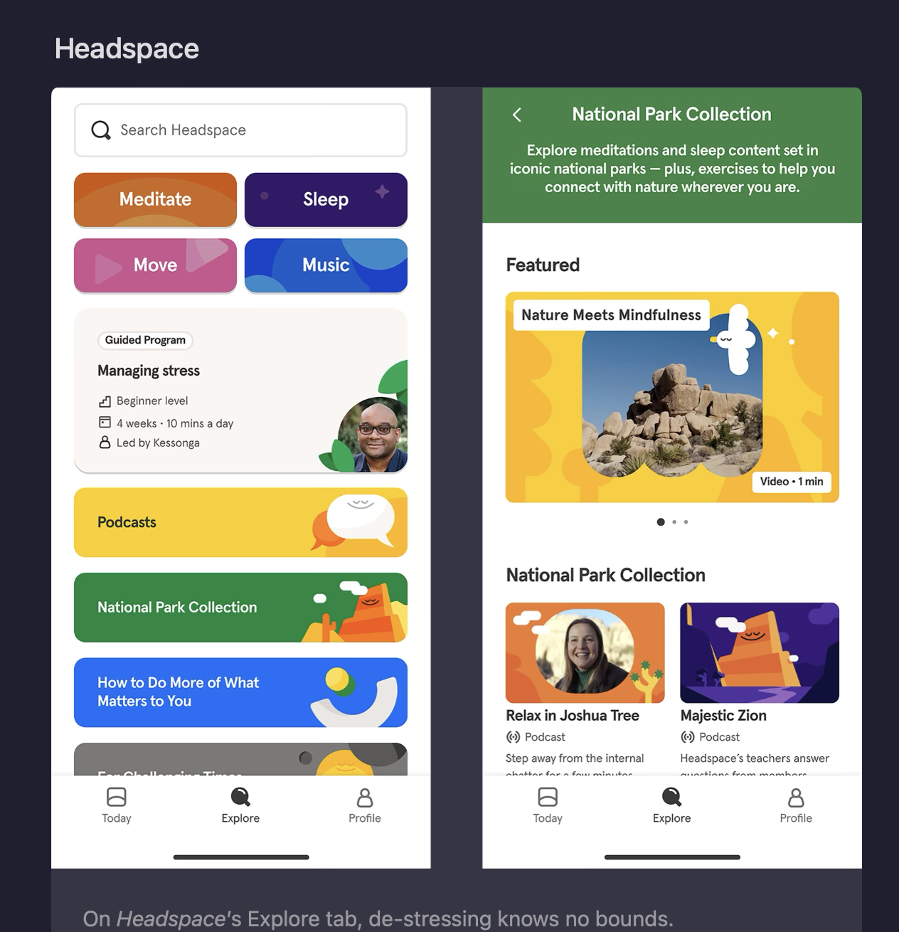
# headspace's non-heady homepage
I wonder what we will think of this design in the past? Are all design trends just like fashion trends and we'll think of the frosted-glass effect as we do waterbeds and aquane? Design like Headspace's is really pretty to me but I can't help but think that it will bizarre in retrospect.
# fav editor color theme
One of them is "Monokai Pirokai Beach Sunset":
# links galore
- personal wiki (opens new window)
- i have a hedgehog what do i do (opens new window)
- sing-sing.co (opens new window)
- mindprod (opens new window)
- listopia (opens new window)
- octoverse... the graphs! (opens new window)
- v cute (opens new window)
- rather clean (opens new window) - misc resources (opens new window)